
 Then there is a tool for you!
The last few weeks have been pretty amazing! I was given the opportunity to work on an ad for a permanent marker, and so I created one for the very well known brand known as Sharpie! It was quite a learning and growing experience, so let me tell you all about it!
 The Project
The project had me first visit a random product and consumer generator. When I would click the generate button, it would give a different project each time. Depending upon how the gamble went, I was to then work on a fitting ad that matched the criteria that would be outlined. My results were the following:
Product
- Product Name: Permanent Markers
- Product Brand: Sharpie
 Target Audience Demographics
- Gender: Female
- Age: 35-44
- Relationship: Married
- Education: Bachelor’s Degree
- Income: $90,000
- Media Consumption: Blogs and Social Media
 So from here, I knew that I needed to make two different versions of the same ad, one to meet the the size for a blog (300px by 250px, at 72dcpi) and the other for social media (400px by 209px, at 72dcpi).
 Sketch Set One
When it came time to sketch, I needed to remember who my audience was. I pictured middle class, working women, and younger mothers. With that in mind, I first thought that I would make a very simple, yet elegant design that would just feature the product against a white background with a tag line that would grab and invite the consumer to purchase the product. I made a mixture of traditional sketches as well as some digital sketches.
When I had finished, I really liked the hand scripted look of the call to action line. It just seemed to really scream that this was the direction I needed to go, like it had been written by a Sharpie. I made a note that when I started to make my first round of digital mock-ups, I would try to keep that as best as I could.


A Photo Shoot
I like to take my own images if I can for each of my projects. This one was no different. I went and set up a miniature photo studio to capture as many different shots as I could. If you want to do your own, just remember that the initial set up for the subjects is nine tenths of the battle! Take your time and set everything up perfectly, adjust lighting, backdrops, etc, before even taking the first photo. It will go a long way when you start the touch-up work or manipulation later.

Here, I have all of the photographs that I shot for the entirety of this project (some were for the second round of drafts and sketching, so some slight spoiler warnings). The set to the right is much different than the rest. With these I wanted to play with potential final design compositions in advance before I had started to do any manipulation work.
Digital Mock-up Round One
 After going through all of this prep work, and the two different ideas of who the actual targeted consumer were to be, made it hard for me to actually decide upon a clear route I should go. Being unable to decide just yet, I decided that I was going to make an initial digital mock-up for each and have product testing done to help determine the right direction I should go.
These four were the result of my work. After I had taken it out for product testing, but in the interim of getting the results back, I looked over the designs, and realized that they would each be a stronger design if the backdrop of the two tag lines were to switch places with each other. I wrote down this observation for when I went to do finalizing work later.
 Product Testing Results and Sketch Set Two
When I got the results back from testing, I was a little shocked. The test audience really like how clean and clear the ideas were, but they felt that it was a little too safe. In other words, they thought it was very well designed, but that it was boring. What I needed to do was make my design more whimsical if I was to truly convince the targeted consumers that this was something that they needed to act on.
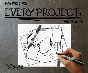
 Like I stated in my last project post about the ceramic icon, this is a normal occurrence in the design process. With that in mind, I needed to go back to the drawing board. I had two really intriguing ideas that kept coming back to me. The first was taking inspiration from Escher’s Drawing Hands. Instead of the hands drawing themselves with the pencils/pens, what if they were using a Sharpie? This of course would mean I would have to make my own version of the hands, in order to better match the Sharpie’s iconic look on paper better. It really needed to sell that this was something a Sharpie could in fact do, and was a practical use of the product.
 The other design had some similar thoughts behind it. What if I had a piece of paper, with the tag line written by a drawn Sharpie, to be in fact drawn by a Sharpie? When I went to start making the final round of the digital mock-ups, I took a few ideas from both of these sketches into the design.
I also played a little bit with the color of the composition at this point. Up to this point, I was trying to keep my design within the monochromatic color sequence inspired by the classic black Sharpie, with black, white, and a light gray being the only colors.


 My Different Elements
For this project, I decided to take advantage of a new tool in my arsenal: the Samsung Note 8 and the Adobe Draw app. The Note 8 comes with a stylus and a screen that is pressure sensitive, and the Adobe Draw app supports those two features. This was amazing! Normally when I have done digital sketching, I have used a Wacom tablet, connected to my computer. This does the job, but it has never had the same feeling of traditional pen and paper sketching, mostly how I never am watching my hand move nor do I interact with my digital canvas as if it were paper, having it locked into a static position on the computer screen. Not so with the Note 8! It was much more like the pen and paper that I so loved!
So when it came time to create the different images that I was going to be manipulating for this new design, I created two of the different elements there, namely the hands drawing each other, and a drawn, open Sharpie for each hand to hold as they drew themselves. The other two images that I used were taken from a second photo shoot (images further above).
 The Final Products
After scrapping my original design in part, and all of the reworking, I finally finished an ad for Sharpie Permanent Markers that meets the more whimsical demand from the product testing. This was a challenge from the moment I got the type of ads I was to make; I normally work at a much larger image sizes for most of my projects, and to suddenly make much smaller designs, made this whole experience one of the best projects that I have ever done. I tried so many new tools, creative thinking processes, and am so happy that I was able to make a product that I am very proud of. It is not often that I get this kind of growing experience, and I am glad I was able to have it!
 As you can see, with the different dimensions of the two different types of ads, there had to be some slight altering between the two in order to better fit the space available. Hope you like them as well, so please leave me a comment of your thoughts and subscribe to my blog to see even more projects from me in the future!

Wow this was really cool! Loved learning about this process. Great post!!
LikeLike