Again!
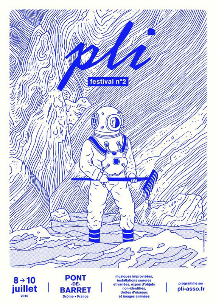
I was casually perusing around Pinterest this last week, just looking at vector rendered posters for inspiration for projects, I came across this beauty. It intrigued me, so I thought it would be a great image to analyze and break down what made it successfully catch my attention.
The Symmetrical Balance
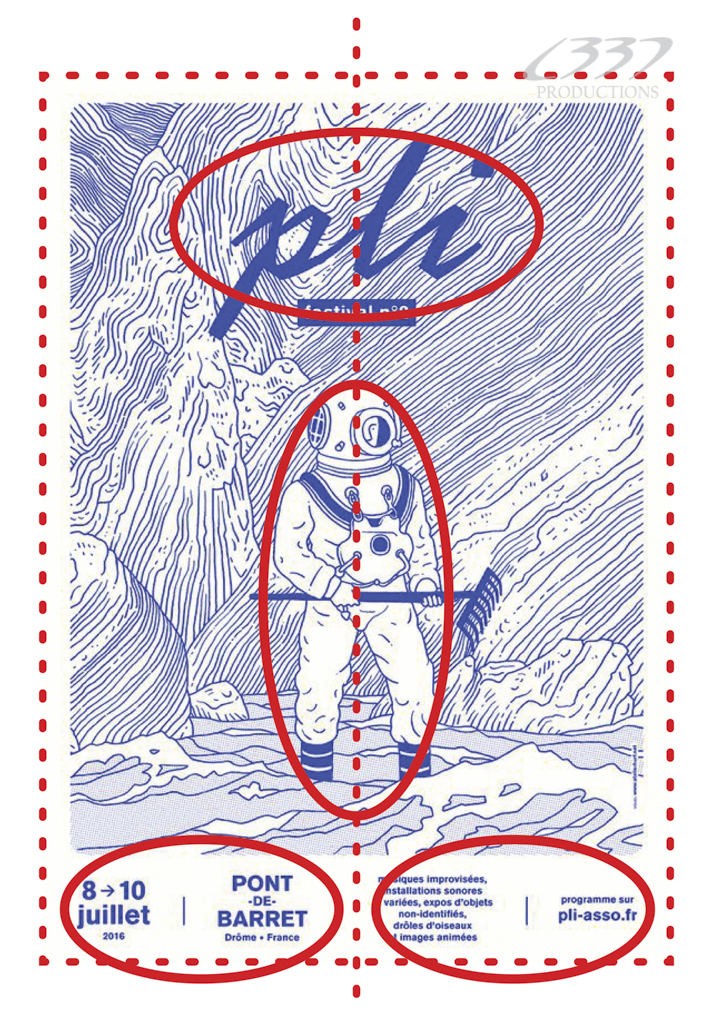 What always seems to be the design aesthetic that always seems to catch my attention is the symmetrical balance. I outlined in red dashes the compositions boundaries and the mirrored axis. I circled the elements that centered along that axis point; the name of the event at the top, the deep see diver, and the text at the bottom.
The Color Palette
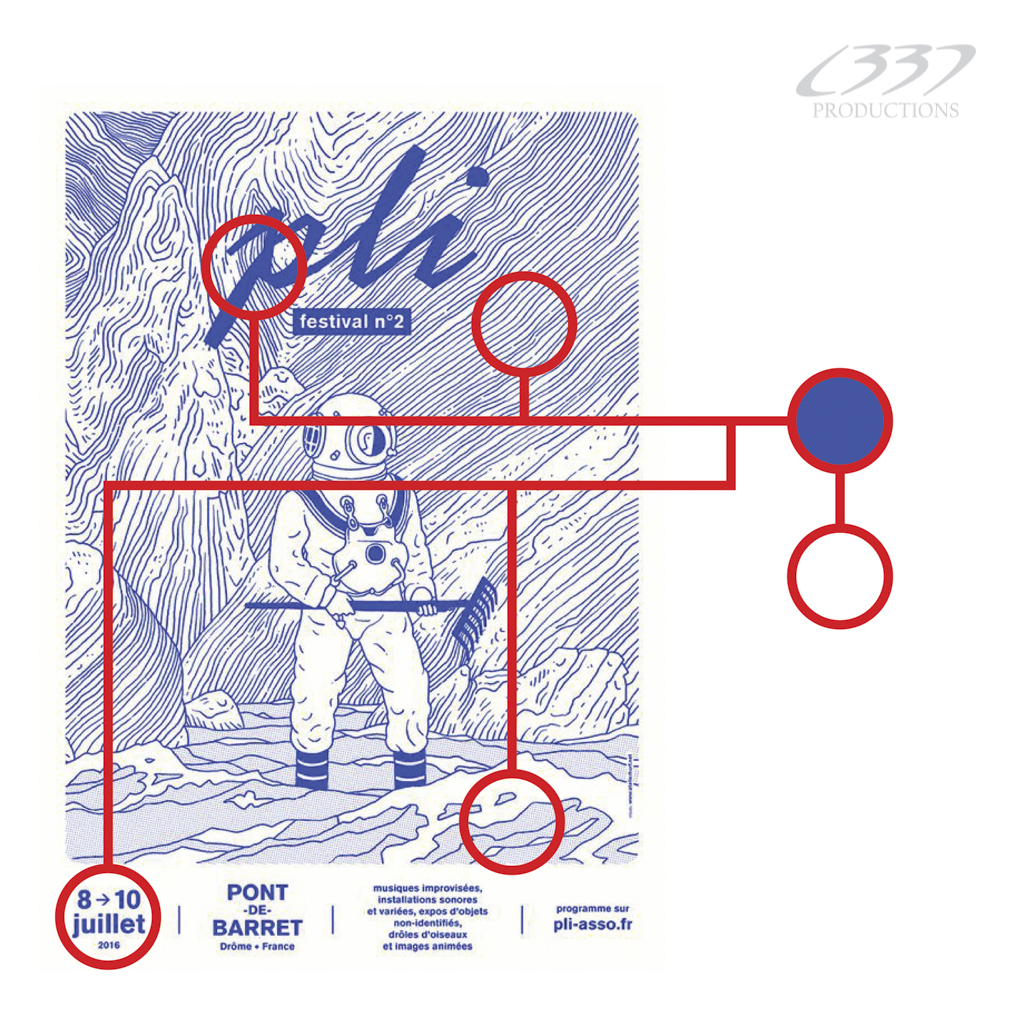 Another thing that stood out to me is the color palette. It only uses two colors: blue and white. Its can seem like a head scratcher, because when you look at it, it looks like a monochromatic color scheme with different values of blue, with some areas look like they are darker than other parts. In reality, it is all just that single blue, and the areas that are darker are achieved because of a technique called halftones.
Halftones
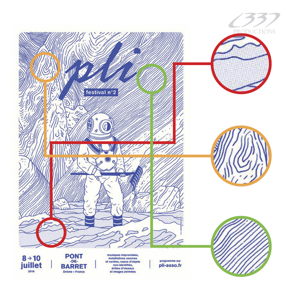 Halftones are created due to the proximity of one line or shape to another. The closer they are, the darker that area is going to appear. the further apart, the lighter. In this piece, the artist utilizes three general patterns to create the illusion of value contrast in their piece (shown in the draw-over). The rules of which pattern is used is determined by the surface of the object it will be applied to.
Last thoughts
For a poster, the attention attracting elements are what make a poster effective in communicating information to the viewer. If it doesn’t do it immediately, you lost your audience, and whatever the event is, it fails if no one shows up. For this event, the artist created a poster that used a unique two color scheme, halftones, and a symmetrical composition as just a few of his tools to arrive at that end goal. Considering that this was found on Pinterest, competing against so many other vector rendered posters and designs, shows that it even translates on the web very well.

I can assure you that I didn’t use any vector.
Thanks for your publication anyway. But you should put my name somewhere.
LikeLike