…and loving it!
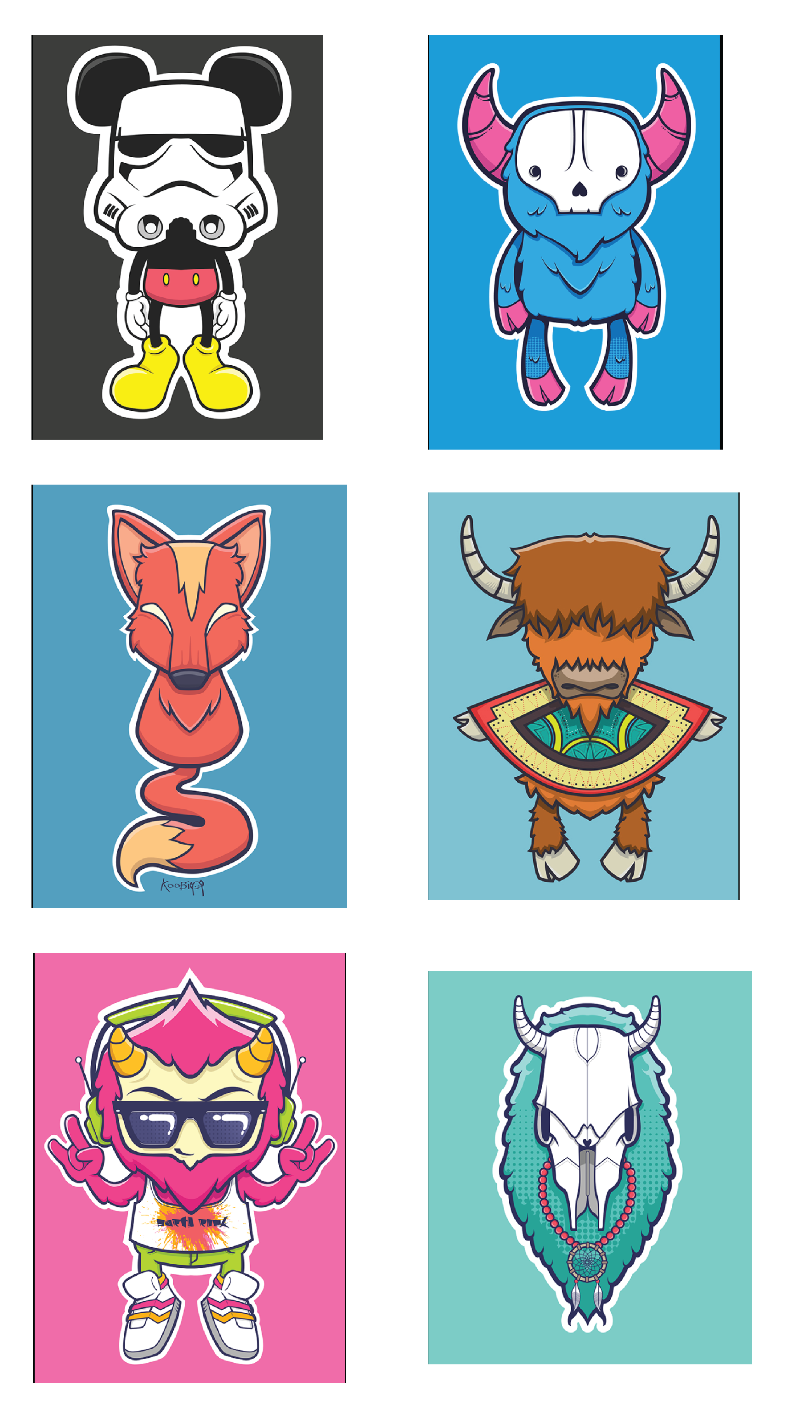
In preparation for the project I am working on, I wanted to show you a professional artist’s sticker set! I am also going to be breaking it down for your as well.
The artist that I found is Katherine May Binamira. She is a freelance Graphic Artist living in the Philippines (link to her Behance, which is where I pulled all of the images that I will be breaking down today).
The Stroke
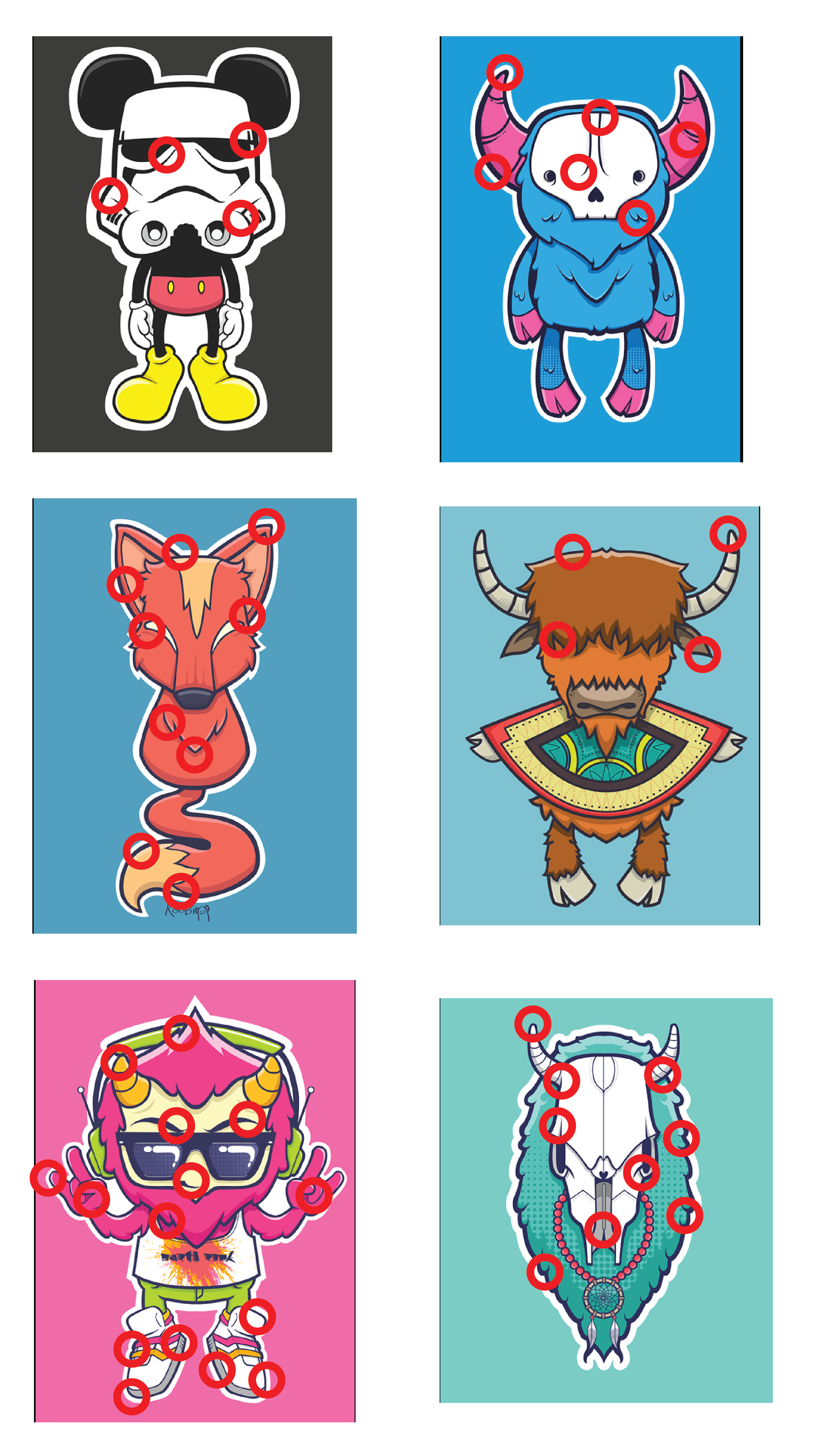
Something that helps to unify her designs is that she uses a variety of stroke weights and shapes in each of the stickers. This variation helps to make each sticker retain that hand-drawn feel.
The Lighting and Shading
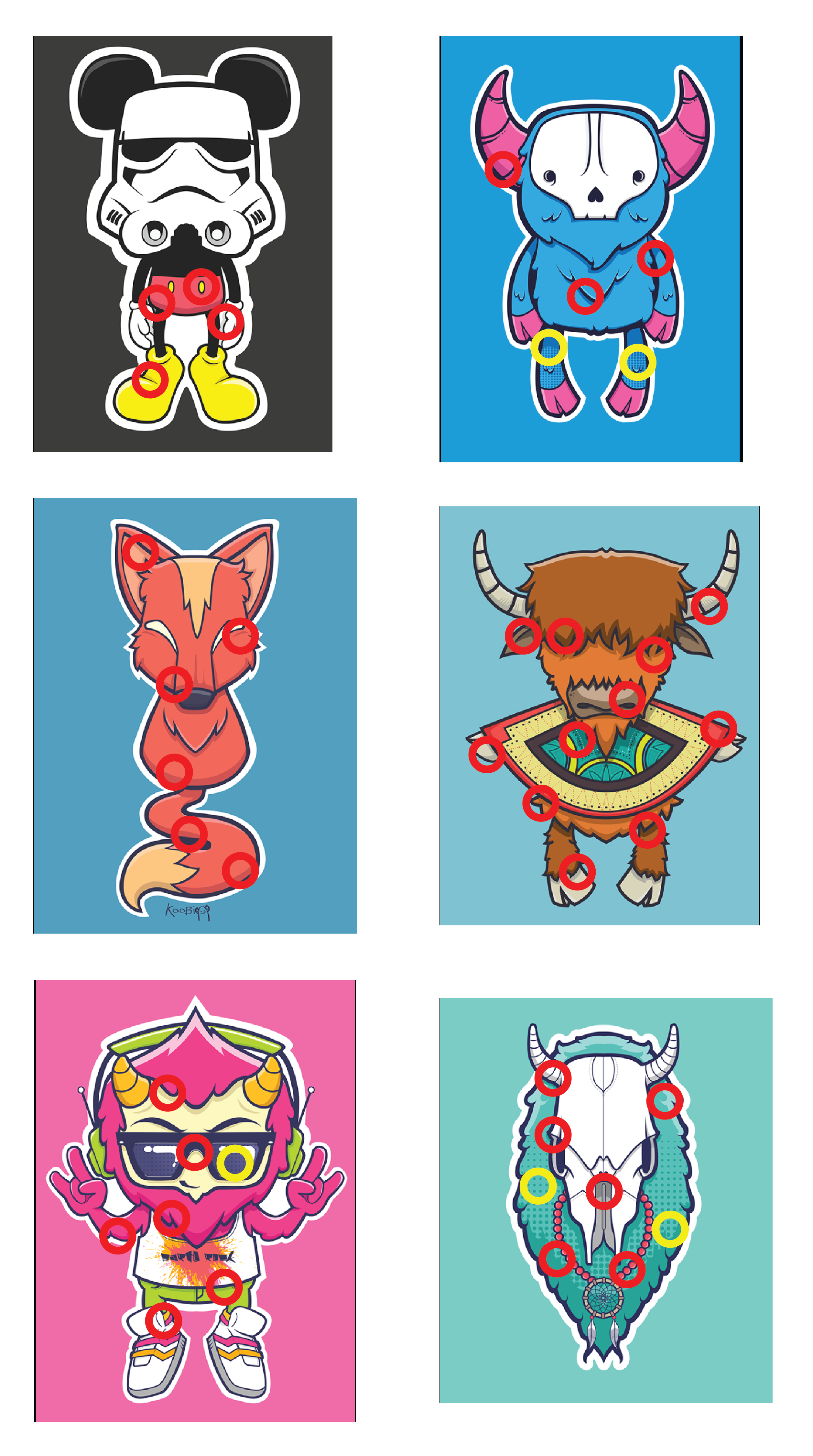
Yellow circles=halftones
Katherine uses two different styles for shading. The most common is that she takes a darker hue of the base color and has it contour around the shape of the objects, to help give it a more 3-D feel.
She also uses halftones in half of them as well. She uses it when she wants to indicate that there is a different texture than the rest of the object.
The Die Cut Border

And finally, to tie it all off, she applied a die cut border that is offset from the main sticker art. The Yak is assumed to also have a die cut border, but that it does not use white, adding a little variation to the repeated border style.
