
…into the design.
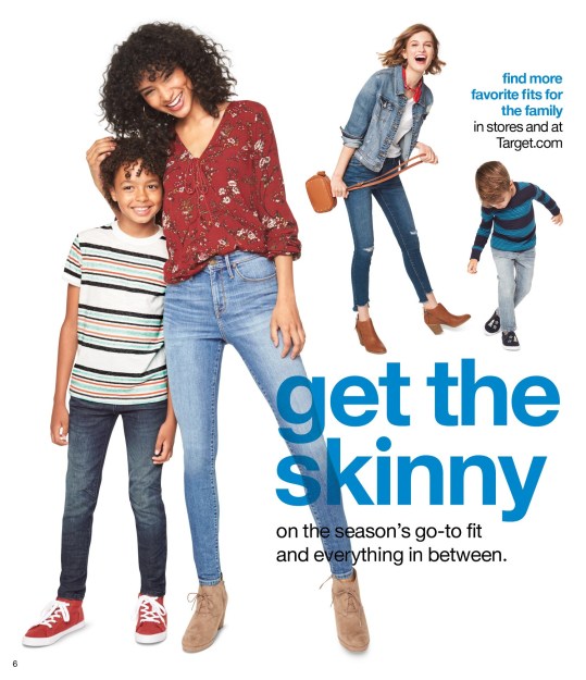
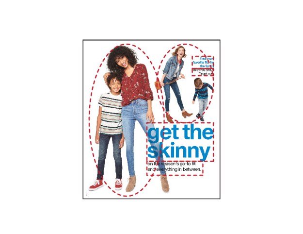
Let’s take a closer look into Target’s weekly ad. The above image was taken from their ad during the week of Sept. 17-23, 2017. This ad is for skinny fit jeans sold at the store, whether it be online or at a physical store location.
Just some background
Target is a retail department store that was founded in 1962, by concepts designed John F. Geisse and the Dayton Company, in Minnesota. Since it’s initial founding, Target has since spread nationwide, providing goods and services to patrons, ranging from clothing (like advertised in ad I will be analyzing), to furniture, electronics, grocery, and more.
A closer look into the alignment
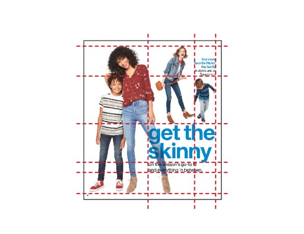
I took the liberty to provide red guidelines over the ad, to make it easier to see how everything lines up nicely in this ad. Lets start by working from the top down, then left to right.
At the top, the heads of the two adult women are aligned and the bottom of the upper-right hand corner text aligns with the top of the child on the left’s head. At the center of the page we see a strong supporting alignment, where we see that the top of the main text lines up with the fingertips of the women with the red shirt, the shoes of the women in blue and the child on the right. The next alignment down shows that within the text block the top of the small text is in the same line as the bottom of the “y”. Next, the bottom of the text is aligned with the bottom of the women in the red shirt’s jeans, just above her shoes. And last, the feet of the child on the left and women in the red shirt line up.
Now going from left to right, we see that the larger text is all left aligned. The next two lines shows something really cool. The text in the upper-right is right aligned, but the bounding box that holds the text is aligned with larger text’s “h” and the right most letters.
How about into it’s color pallete?
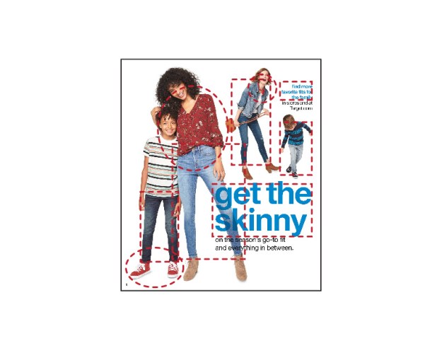
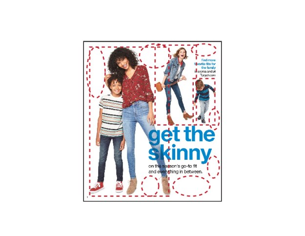
Here, we see that the primary color in this ad follow a monchromatic color scheme, utilizing blue as the base hue (outlined in the red rectangles). Seeing that this is an ad for jeans, this is pretty cool. The main text headlines are solid blue, with all of the denim in the advertised product providing the different shades and tints.
Circled, we see that the accent color chosen for the ad is one of the triads for blue, red. This is also a Target ad, so seeing the color is meant to remind the viewer that the shown products are available at their locations.
The different element’s proximity to each other?
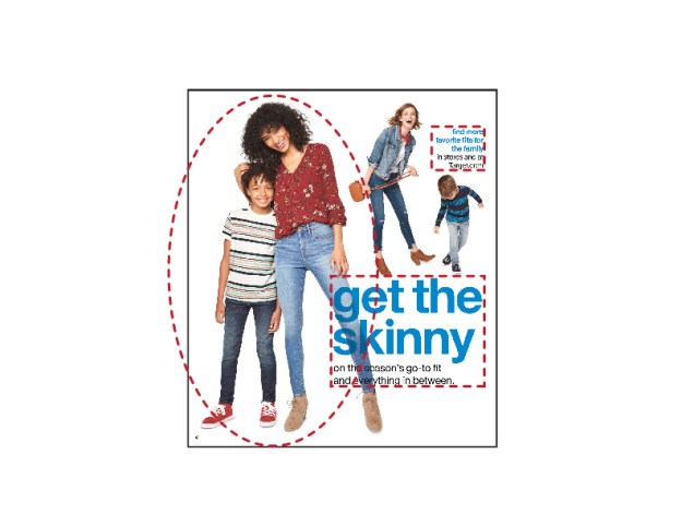
We see three different, distinct groupings. The text make up two of those groups, and the assumed mother/son relationship.
With the text, we see two headlines (written in blue) with body text underneath. The different placements of the two groups indicate that they are providing different information.
The physical interaction between women in the red shirt and the child on the left, as already said, seem to have some sort of familial relationship (such as a mother/son). It also helps see that the other two figures shown are not interacting with each other, nor are they close to each other, so no bond can be assumed between them.
What’s repeated?
We see that there is a repetition of the models for the ad. We have two adult women and two boys. We also see that each is wearing blue colored jeans. Variation with the different jeans on the different models helps to show that the jeans are available for different types of people.
Within the text, we see that the headlines are written all in lowercase, as well as put in blue. The main body text is also in lowercase, but put into black. This also shows that there is a relationship between the information provided by the text.
And finally, a closer look into the contrast
I have made two different outlines for this closer look; circles for the white space and rectangles for the darker elements. By having placed a white background behind the models, our eyes quickly focus on the other objects on the page. We quickly see and recognize the models, and are able to distinctly see the outlines of the jeans they are advertising.
What does any of this mean?
By having taken a closer look into the different elements on this ad, we can see how this is an effective ad. We see that the Target ad follows closely five design principles (alignment, color, proximity, repetition, and contrast) to help its targeted audience, their patrons, to quickly understand what the ad is for (skinny jeans).
